CAMP.iQ - UX Design
Project Vision
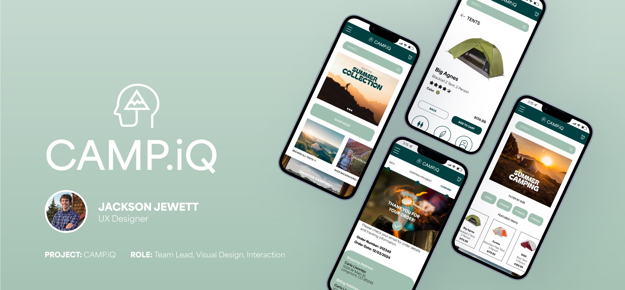
CAMP.iQ is a camping e-commerce app that will allow users to search, view, categorize, and purchase camping equipment. They will be able to filter by price, size, and color to meet the needs of camping enthusiasts by creating accessibility, expertise, selection, and simplicity. We will measure effectiveness
by evaluating sales, traffic, returns, and
other KPI’s.
Challenges
Design a cohesive interface for target users.
Provide a seamless filter feature for users to search and select a product that meets their needs.
Make product features easily visible and comparable.
Simplify the product checkout process.
Kickoff
Our process began by doing some qualitative research to learn more about the prospective user and align our data to meet design goals. We conducted an in-depth competitive analysis of four other e-commerce apps, conducted stakeholder interviews, and constructed a hypothesis for each of our personas. Most importantly, we asked ourselves a few key questions:
Meet the Users
Name: Chris
Age: 19
Occupation: Student
Name: Carla
Age: 29
Occupation: Dental Assistant
Name: Jonathan
Age: 58
Occupation: Project Manager
Competitive Analysis
When we looked at our target market for apps to buy a tent, four main competitors stood out as the best. REI, Backcountry.com, Cabela’s, and Walmart all met the requirements for our users needs and offered a variety of tent options. After the audit was completed, it was clear that CAMP.iQ needed to have a simple and obvious filter feature to allow users to view tents by size and style easily. The app would also need to make it easy to compare technical features between tents so users would not have to go back and forth between product pages to understand the different offerings.
The User Journey
The goal of our user journey was for easy navigation from the homepage through the tent selection process. It was critical that users were easily be able to find a tent that met their needs, add to cart, and checkout in as few clicks as possible. When we built a user journey map the two most important parts of the process were inside the product pages and before the checkout process. Streamlining these two areas would make the journey easier for the user to make decisions and easily complete their purchase.
Initial Wireframes
Our first step in the design process was to draw initial paper wireframes to ideate the user journey. Building flows that will allow users to view the homepage and navigate quickly to the tents page was our primary goal in the first drawings. In the image above, you can see how we built different design mockups for product, filter, and homepage layouts. After filtering out the best iterations, the first set of lo-fi wireframes highlight the tents by category, as well as make it easy for users to find the “browse all tents” button. Our users made it clear they did not like to be overwhelmed by choices and were looking for a simple solution.
In order to keep things simple the main selection for popular tents is clearly labeled, and category buttons show the selection of product so they can filter easily. These tools eliminate the need to click and select a separate filter button and save the user time. This will help the user find a two person tent quickly and easily!
Iteration
Our team conducted a usability study to gain insights on the first iteration of the initial prototype. We discovered that users loved the product but a few changes were necessary in the navigation and checkout process. The four main findings were critical to delivering a well-crafted final prototype.
No filter.
Users loved the new category filter feature, so we pushed it to the center of the frame to help users see them quickly!
Search complete.
The search feature helped users find products that met their specific needs, so we made the button larger and more visible.
Too many taps.
Users wanted a faster checkout process, so we streamlined the interaction and saw increased conversion rates.
Add to cart.
The cart button was hard to
find for some users, so we
made it the main button in
the top navigation.
Design Kit
The colors, typography, and iconography of CAMP.iQ all represent the feeling of a great day spent in nature. The greens are organic earthtones, leaving the user grounded and as though they are in a safe space. Geometry is rounded and icons are playful and simple.
Takeaways
The design of CAMP.iQ has allowed users a simple way to find a tent that meets their needs based on a data-driven research approach. By defining our goals, perfecting the process, and analyzing feedback we have built an e-commerce journey that is fluid and simple. We succeeded by implementing a well-crafted category page that filters tents by size, eliminating steps in the checkout process, and adding a search feature to the user interface. Overall, conversion increased by over 30% and our total checkout time decreased
by 25%!


